11 · The symbol in miniature
App icon and favicon
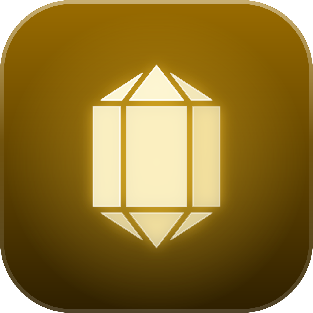
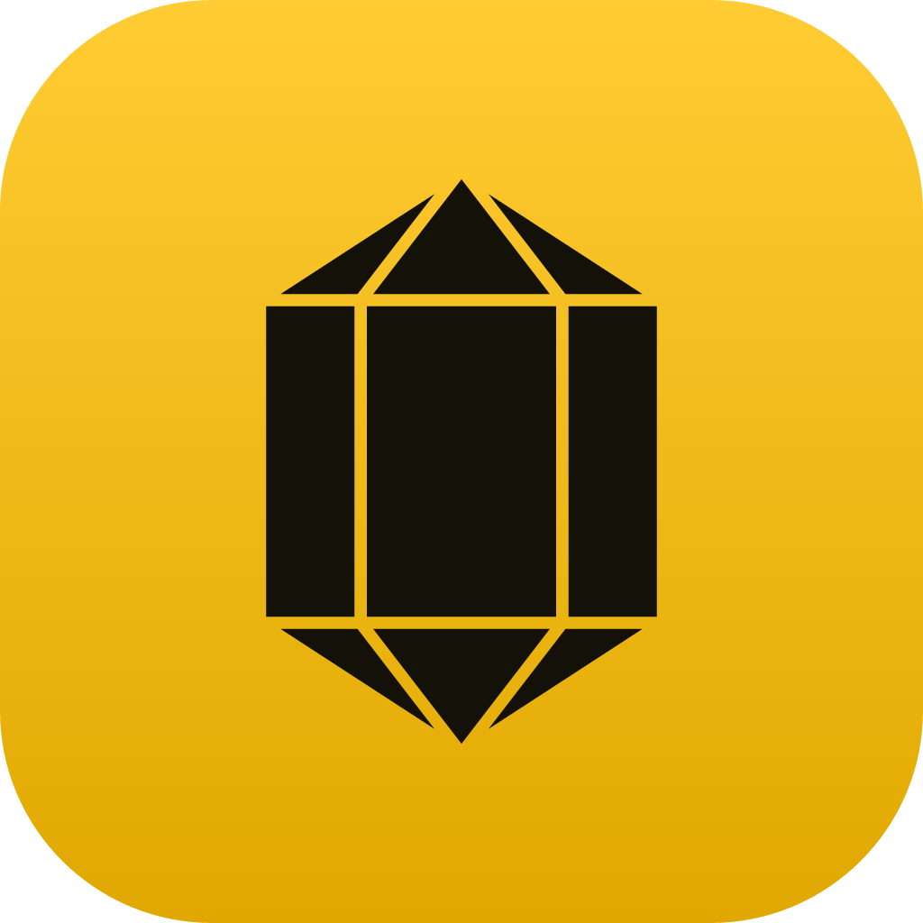
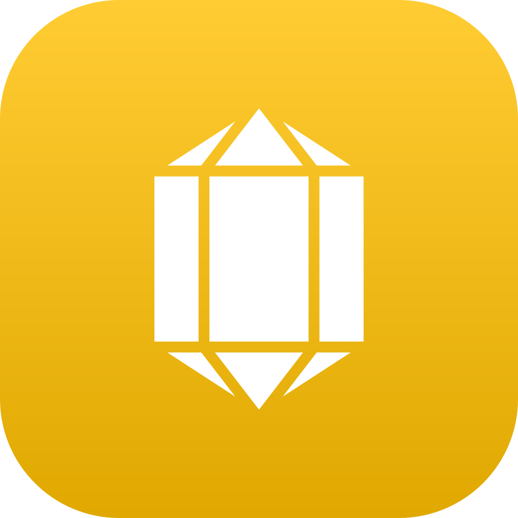
The icon is the first thing seen on a phone or in a browser tab. There are three versions of the same idea, depending on space and background.
In an icon grid
Next to other apps, Heliodore must stand out from afar and not be mistaken for a notice. Look at the icon among colored neighbors and in both system themes.
Icon rules
- Corners
- Those of the file (radius of 23% of the side). The operating system crops; it is not rounded twice.
- Margin
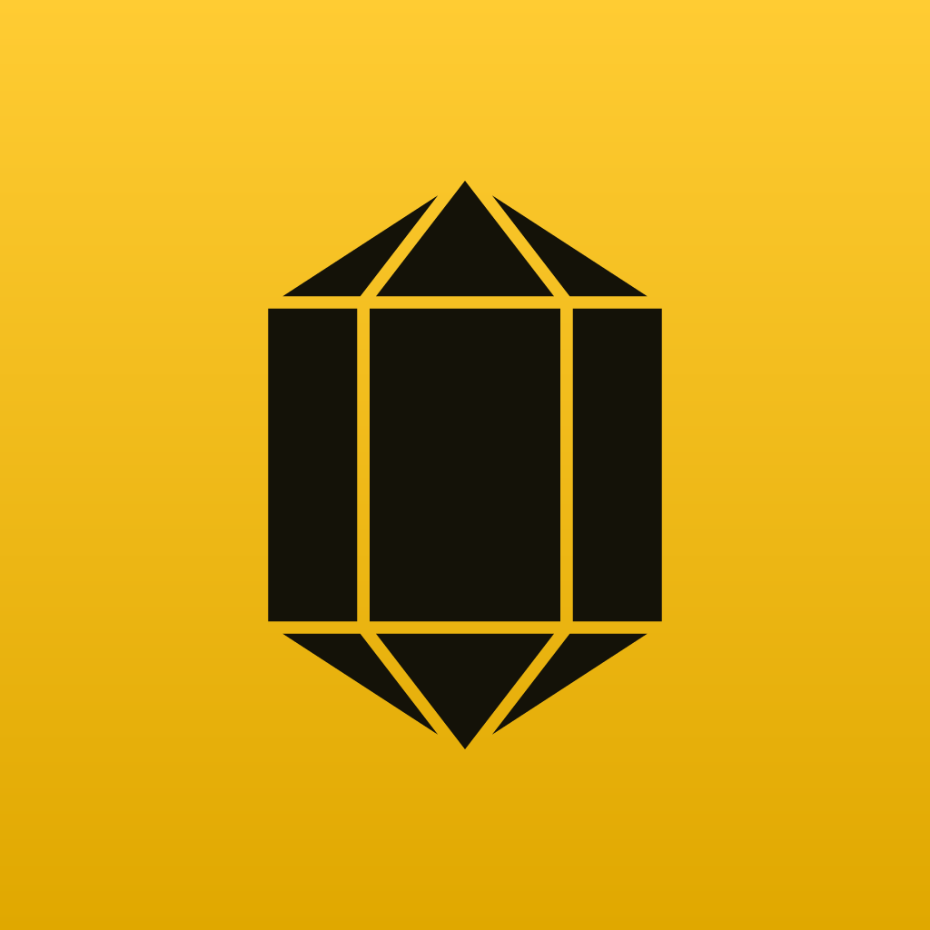
- The crystal takes up 70% of the side. It is not enlarged to “fill”.
- Text
- No name inside the icon. The system places the name below.
- Dark crystal
- On yellow, the symbol is dark (#141208). On the amber gradient, light and luminous.
- Favicon
- Flat version at 16, 32 and 48 px from the kit. At 16 px the gaps are not visible: that is normal.
- Badges
- A red notification dot is not placed on the crystal: the system puts it in the corner.
Favicon and tab
 Heliodore · Brand manual
Flat version, legible at 16 px.
Export sizes

PWA 512 and 192, Apple touch icon and 32 px favicon, all in the kit.
Circular avatar
WhatsApp, social media and email profiles crop the icon into a circle. Check that the crystal does not lose its points.
Always use the “square” versions for avatars: the system circle does the cropping.